A beloved GameCube classic from 2004, Paper Mario: The Thousand Year Door has been deemed worthy of a new release on Nintendo Switch a full 20 years later. Original developer Intelligent Systems is at the helm here, substantially reworking its visuals, rearranging its soundtrack and adding a suite of bonus extras via a new gallery section. It’s a fittingly lavish upgrade for a game that still holds up today, with its charming paper and card aesthetic, interesting combat system, and captivating level design. Unfortunately, the visual upgrades come with a stiff frame-rate penalty, with the original 60fps target on GameCube dropping to 30fps on Switch. Was that the right move, or is it too severe of a cut? We’ve tested the opening chapters to deliver an early verdict.
To cut to the chase, Paper Mario: The Thousand Year Door is one of the most unique RPGs to land on Switch. Its paper aesthetic is a huge part of its appeal, of course, and feeds directly into the game design too. Once Mario lands at the very first hub area, Rogueport, every location you enter features backdrops that fold out and collapse like a pop-up book. It’s all rendered in full 3D, but the conceit of building a world out of wafer-thin material creates this wonderful diorama effect. It’s a miniature, paper playground working to its own logic, allowing you to flip, bend and fold its world – and even Mario himself. Aesthetic and game design blend into a beautifully cohesive whole.
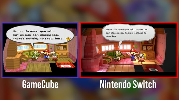
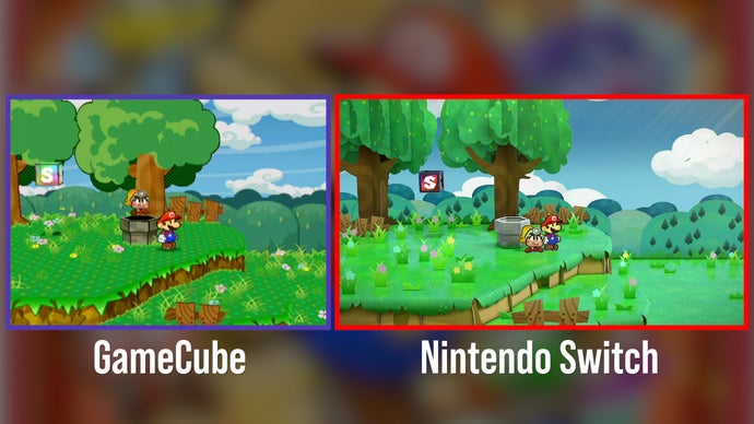
This Switch Edition visual overhaul goes much further than I expected, though it very much keeps the core gameplay loop, level layout, puzzles, and dialogue from the GameCube original. There are reworked textures across almost every visible point in the world on the Switch version, while UI elements are reworked to suit modern TVs. Geometry is rebuilt from scratch for every level – and even 2D sprites are swapped out for full 3D replacements, often with the aim of emphasising the effect of cardboard cut-outs. There’s a huge amount of extra detail layered in. Crucially though, what’s here is still in keeping with the spirit of the original, even if textures and geometry are redesigned.
Bringing The Thousand Year Door up to the modern day, we have two screen-space rendering techniques added to the Switch release: screen space reflections (SSR) for reflective surfaces, and screen space ambient occlusion (SSAO) to shade in the corners of the world. Neither technique was present in the GameCube version, but the Switch release goes to great lengths to use both new visual features.
SSR is applied extensively across the world to give wood, grass and stone a glossy sheen, with Mario, his allies, and background elements often visible in the reflection. However the logic for where SSR is applied is unusual, and not always in keeping with the paper theme. Sometimes it makes sense, and other times it appears bolted on. You might not expect a thinkly laqcuered look across green grass, for example, but it rings true for the wooden floors of item shops. I’d suggest the original GameCube version, sans SSR, often looks more ‘paper-like’ as a result. Still, it’s a substantial change, and where it works, it makes the most of the three-generation leap to Switch hardware.
SSAO, ambient shading, also has a big visual impact – particularly in interior shots with limited light such as Professor Frankly’s study. By comparison, the GameCube original appears much lighter, with the absence of any real shadowed elements beyond simple character shadow maps. On that point, Switch uses much more detailed shadow maps all-round. Every shadow cast from characters and objects has a pleasing diffused edge. Even objects in the environment, like floating platforms, benefit from accurate dynamic shadows and improved lighting, and light shafts are even added into some scenes.
To cram all of these visual features in – the updated textures, lighting, shadows, SSR and beyond – Switch runs at a native 1600×900 while docked. In handheld mode, that drops to a lower native figure of 1138×640. As we often expect from Nintendo titles, there’s limited anti-aliasing in place here, so you may notice a slight shimmer across white character outlines. Despite the relatively low internal resolution figures here though, the game still looks beautiful on modern displays – it’s a proper widescreen adaptation, with a cleaned up UI and text to boot.
Finally, let’s tackle that drop from 60fps on GameCube to 30fps on Switch. The visual upgrades are extensive and generous, but the cost in performance is a noticeable one. Question being: is it too steep a sacrifice for the improved visuals, or a reasonable trade-off to get the game running at this level of visual fidelity? In the developers’ defense, the frame delivery is at least consistent at 33.3ms with almost no deviation, providing a near-locked 30fps readout throughout our testing.
Looking back at the GameCube original, it’s refreshing to see the game run at 60fps. The demands of this version are much lower, of course, running at a native 480p, and it’s worth bearing in mind that GameCube was a more powerful home console than Nintendo’s handhelds of the time. It was perfectly optimised for 60fps for its day, and target spec.


Jumping to Switch today, running at 30fps affects the game in two key ways. Firstly, there’s the lateral 2D motion while running through towns and dungeons. Playing on Switch’s smaller display in portable mode, the 30fps update rate honestly doesn’t stand out quite as much. Blown up on a larger TV, though, there’s a visible difference in the fluidity of motion compared to the original, in running throughthe game’s dungeons, towns and meadows. On the other hand, the drop to 30fps isn’t as evident in combat, given its fixed camera position, but the gameplay does require some measure of timing – for example, hitting the A button just as you strike to add a critical hit. In general, most attacks demand holding and releasing an input at the right moment to deal the most damage.
Inevitably, the 60fps of the GameCube original does give you a quicker visual response to react to these timing sensitive attacks. The mitigating factor here is that Nintendo’s timing window for landing these abilities is often quite generous. On Switch, I’ve had no issue landing attacks so far, but long-term fans of the game may go through an adjustment period.
Keeping the 60fps of the GameCube original would have been ideal of course, but what we’re left with is still a superb adaptation – Paper Mario: The Thousand Year Door has never looked better. I’m also surprised by the extent of the visual overhaul. Intelligent Systems has truly exceeded my expectations for a Switch update in rebuilding so much of the game from scratch. Even if there is a trade-off in performance, it can’t be faulted for its ambition.
For context, this new Paper Mario remake has a few parallels with the Switch release of Super Mario RPG. John covered this late last year and found it an impressive full 3D remake of the pre-rendered SNES original, albeit with an unlocked frame-rate that could drop from 60fps to the mid-30s at points – and perhaps would have benefitted from a similar 30fps frame-rate cap. Given this, the decision of Thousand Year Door developers Intelligent Systems to opt for a locked 30fps is understandable. Giving users the choice might be best of all, but we’ll never be too upset about consistent performance.
